
Redesigning &Charge App: Design System + Wallet & Charging Features
A case study on scaling visual quality and UX flows in a European EV app
In this case study, I’ll share how I helped &Charge — a fast-growing European EV charging app — evolve from an inconsistent UI into a modern, scalable, user-friendly product.
Project context
What is &Charge? What was the situation?
&Charge helps EV drivers find charging stations and earn rewards. The app had grown quickly but was never properly designed. After 5 years, it suffered from inconsistency, poor usability, and lacked a design system — all while preparing to launch serious features like a digital wallet.
European EV rewards and charging app
~50–60K active users
Existing app was 5 years old, designed without UI/UX foundations
New business-critical features needed to be added: Wallet + Charging
My role
Independently led:
UI assessment
Full redesign
Creation of the design system
Collaborated on:
Feature flows (wallet, charging) with the founder
I independently owned the UI assessment, redesign, and design system. I also co-designed the user flows for the new wallet and charging features — working closely with the founder, who had 5+ years of user behavior insights.
Redesign strategy & before/after
Visual overhaul phase
Reworked typography, brand colors, spacing, hierarchy
Updated illustrations and icons to a more mature style
Improved visual balance and accessibility
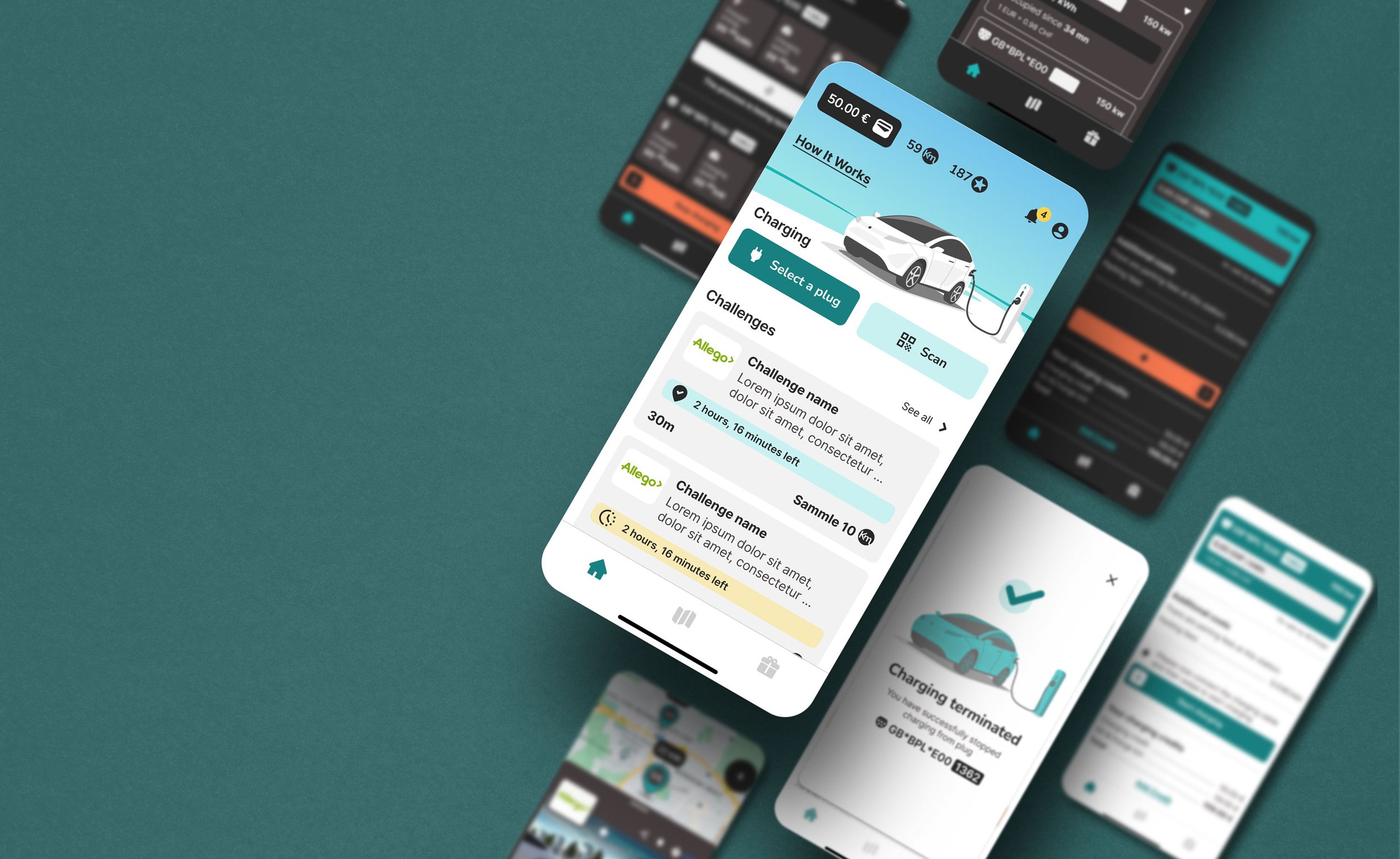
Screens: Home, POI (localizing and finding info about charging stations) tasks , Wallet tasks, Charging tasks
POI map / AfterPOI / BeforePOI / AfterThe redesign brought clarity and consistency. I replaced childish visuals with a more trustworthy style, established clear typographic hierarchy, and aligned all screen layouts with a new system.
Home / BeforeHome / AfterPOI map / BeforeDesign System: foundations & components
Scalable system for future-proofing:
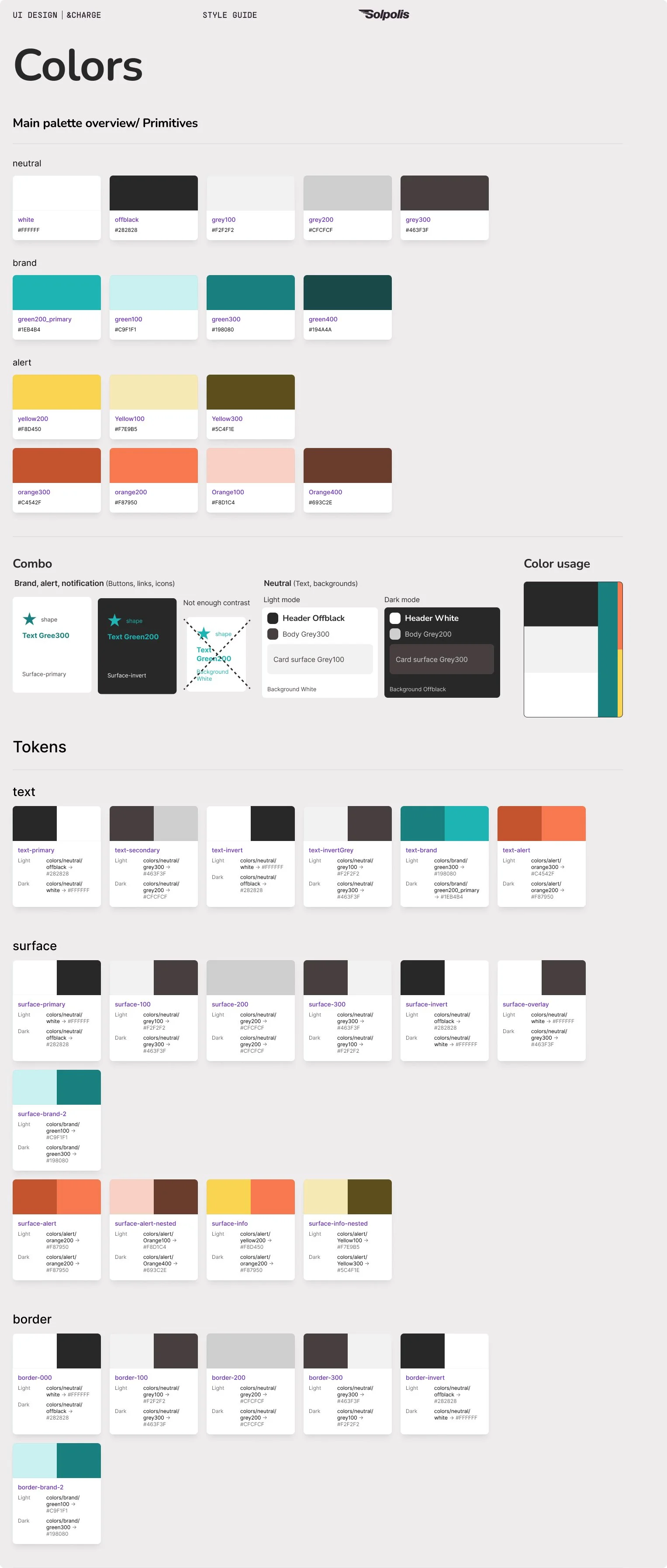
Grid system, spacing & color tokens
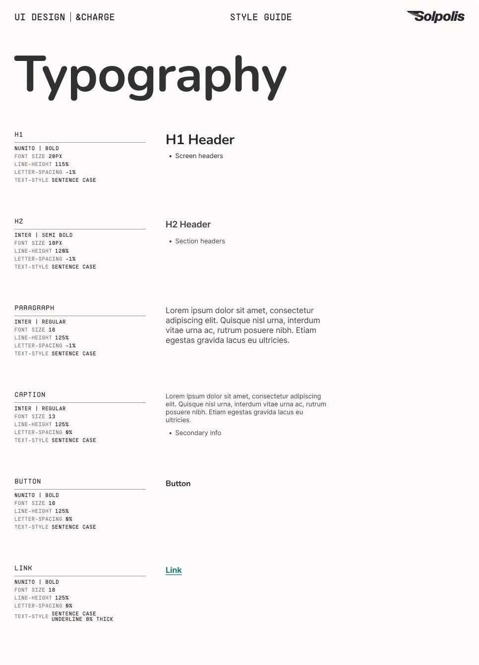
Typography styles (headers, paragraphs, captions)
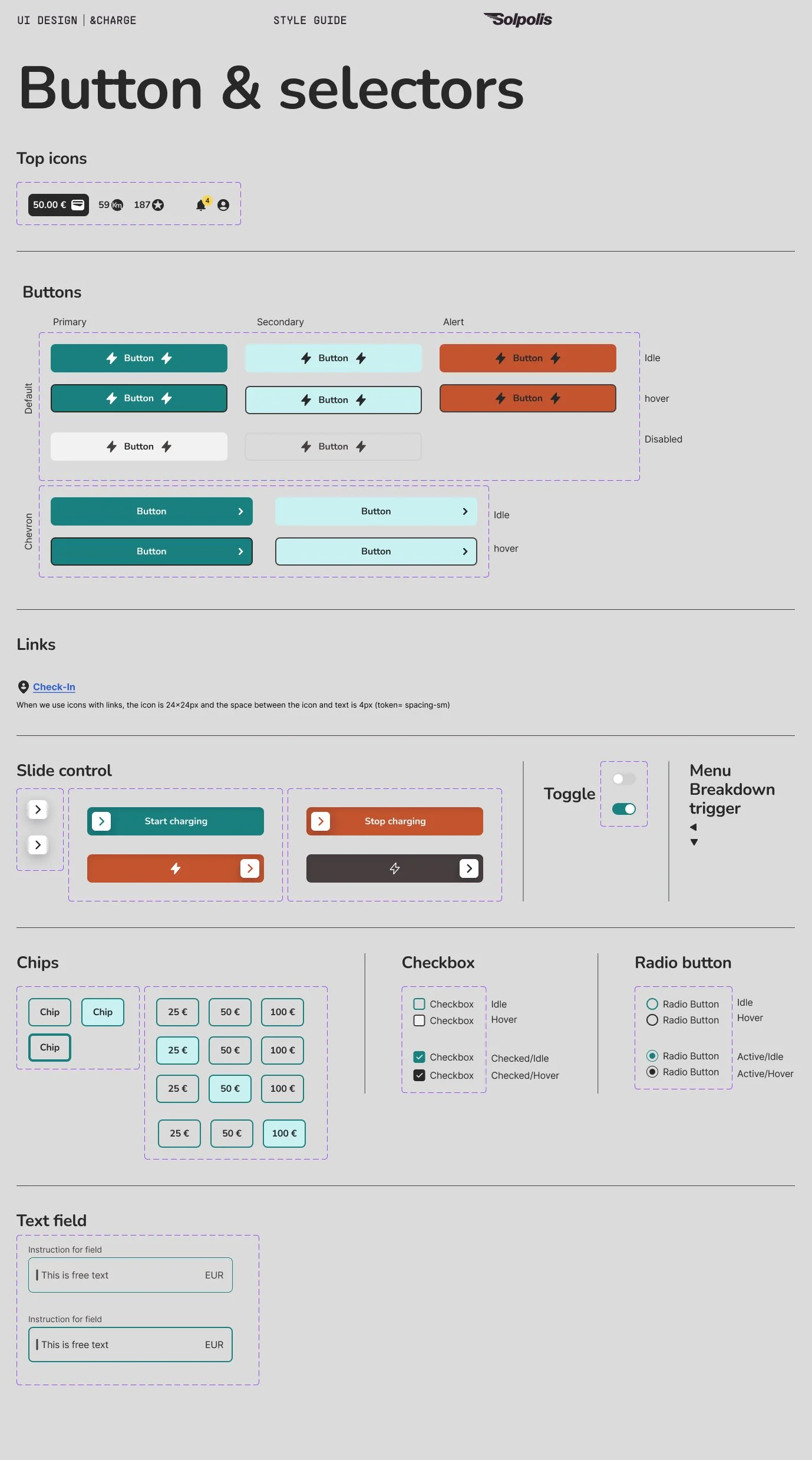
Standardized components: buttons, inputs, cards, overlays, toggles
Developer-friendly specs for handoff reuse and scalability
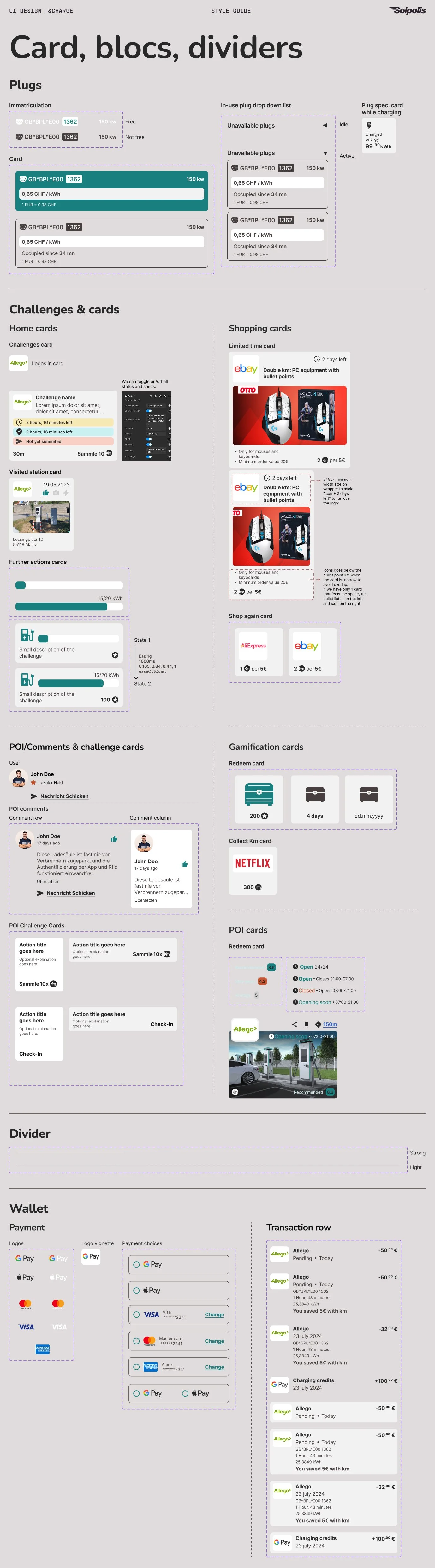
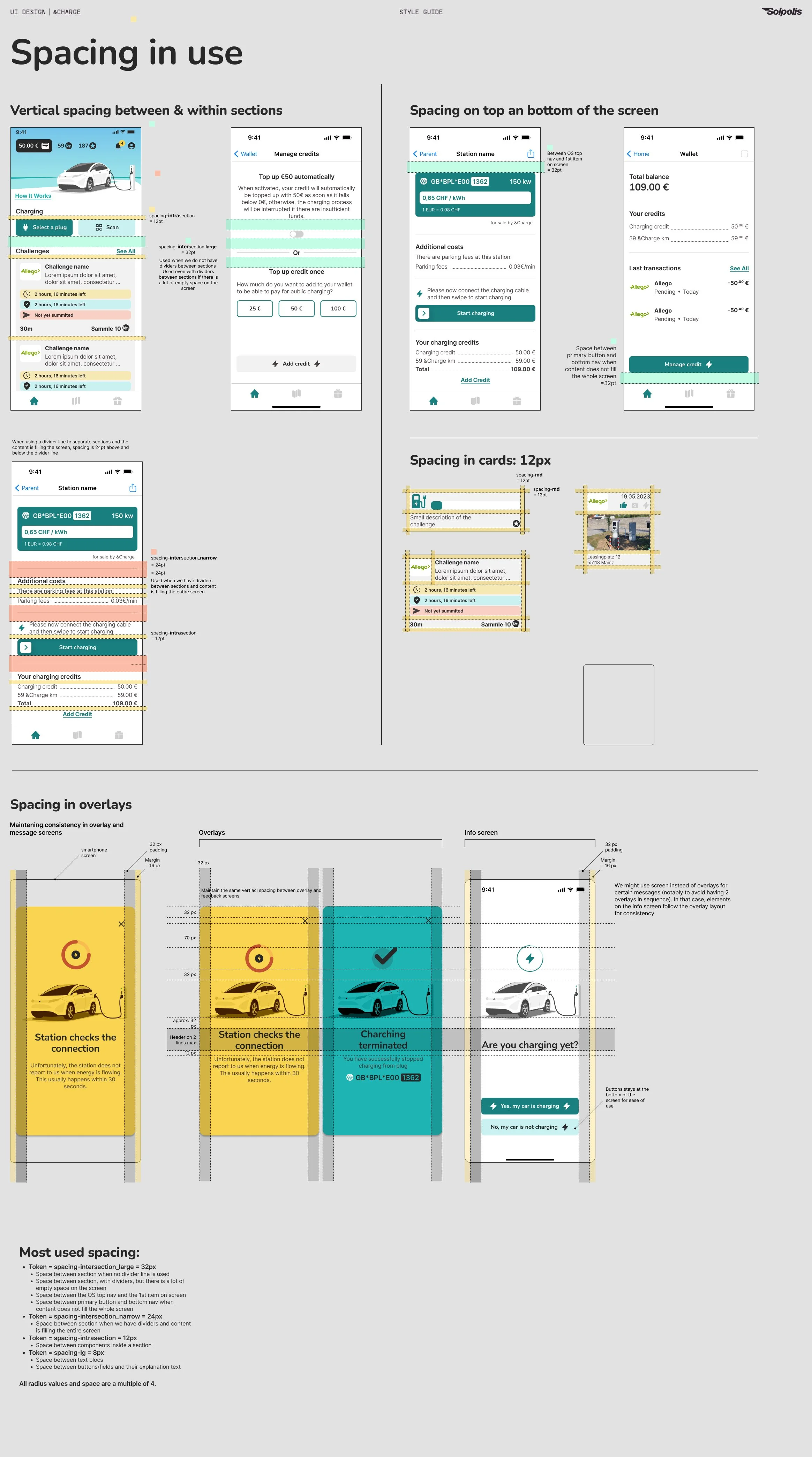
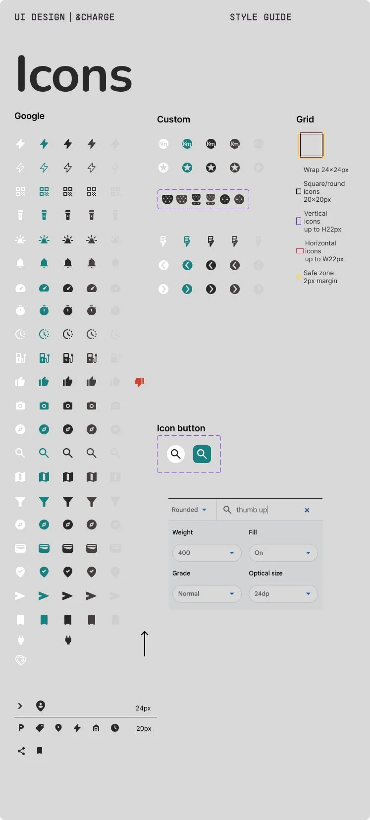
I built a complete design system: spacing tokens, color modes, typography, motion, and all major UI components. This gave the developers a solid base — and gave the product room to scale without future design drift.
-
![]()
Typography
-
![]()
Colors
-
![]()
Buttons & selectors
-
![]()
Cards, blocs, dividers
-
![]()
Spacing
-
![List of icons - customs and Google ones - in the &Charge design system]()
Icons
Motion & Interaction
Micro-interactions and motion guidance:
Motion guide documenting triggers, durations, easing curve
Motion for overlays, action success feedbacks, and screen transitions
Motion book: [open POI info overlay] motion details for developers
To improve feedback and flow clarity, I defined micro-interaction rules and motion specs — easing curves, timing, and triggers — that helped bring the UI to life, and keep consistency in motion.
Motion book: [Expand card] motion details for developers
UXUI for new features
Wallet feature flow & screen design
Credit management & payment integration
Add/top-up credit
Auto top-up option
Convert km points to cash
Transaction history
Fallbacks for insufficient funds
Charging Feature Flow
Enable charging directly from app
Select plugs form POI map or QR scan → Connect → Swipe to start
Live charging status (duration, cost, kWh)
Visual feedback for charge errors or completion
The wallet feature required trust and clarity. The flow was co-designed with the &Charge founder, who brought extensive user knowledge and technical constraints based on his research and conversations with their API vendor. I translated those insights into an intuitive UI — with safeguards like top-up alerts, visible balances, and transaction breakdowns — to ensure users felt confident and in control.
The charging flow was co-designed with the &Charge founder, who contributed valuable behavioral insights and technical details from the charging infrastructure provider. Together, we shaped a guided sequence — from plug selection to swipe-to-start — focused on reducing user anxiety through clear feedback, success confirmations, and fallback messaging.”
Outcomes & result
Modern, consistent UI that better reflects the brand’s maturity
Scalable infrastructure for growth: Developer-friendly design system for long-term scalability
Payment and charging flows that instill trust and reduce friction
Smoother handoff with Figma prototypes, tokens, and motion specs
The final result: a professional, scalable design system, stronger UI consistency, and flows that users trust. Developers now have a system to build from — not redesign each time.


Reflections & Takeaways
This project reminded me that good design doesn’t start in Figma — it starts with listening. I deepened my ability to collaborate, align with product goals, and build systems that support both users and developers. Most importantly, I learned how to elevate flows by turning real-world constraints into clear, usable, and trustworthy experiences.
Collaborating closely with the founder was a valuable learning experience. His user knowledge and direct input from API vendors added depth to the design process. I learned to listen not just for ideas, but for constraints, insights, and intent — then translate those into user-friendly flows. This project sharpened my ability to balance design craft with product strategy and stakeholder alignment.
What I learned
Trust ≠ style: it’s a UX balance
Systems matter more than screens
Product collaboration brings deeper impact